Padmini Aromatics
Brand Identity Refresh
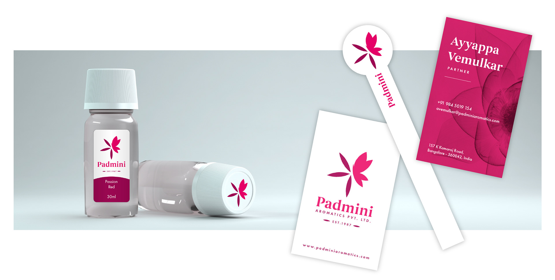
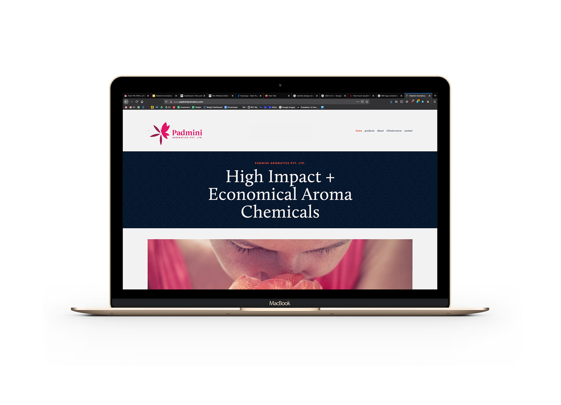
Padmini Aromatics is a chemical company that has been around for a while and strive to be around for even longer. Built on the core principles of trust and innovation they approached us to refresh the brand identity that would communicate these values and build more brand awareness.
The challenge in this project was to keep the legacy intact, and yet present the company as one that is modern and continuously innovating.
The challenge in this project was to keep the legacy intact, and yet present the company as one that is modern and continuously innovating.
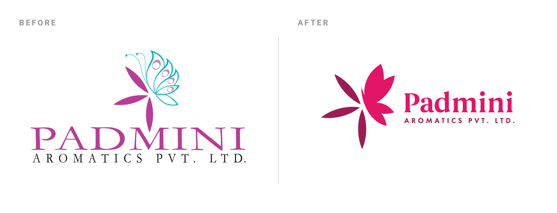
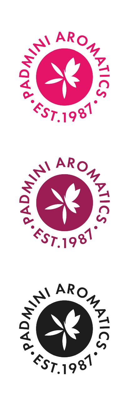
In Sanskrit, Padmini means "She who sits on the lotus". The new brand identity is a bright, modern revamp while keeping the spirit of the old logo. The color palette is simplified to a bold, bright shades of pink.